
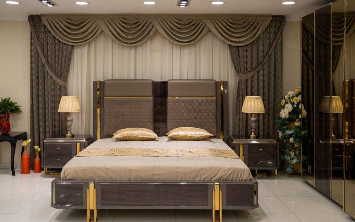
How to Combine Furniture Colors? Learn how to create a harmonious color palette in home decoration by balancing the main color, secondary tones, wood, fabric, and metal details.
How to Combine Furniture Colors in Home Decoration?
The answer to the question how to combine furniture colors is not simply about placing favorite tones next to each other. Furniture colors should be evaluated together with walls, flooring, natural light, wooden surfaces, fabrics, metal details, rugs, and curtains. A balanced color plan creates visual unity within the living space and allows the design character of the furniture to be perceived more clearly.
When creating a new living room or living space, color selection should begin with the entire room rather than individual products. The color of the sofa set should relate to the wood tone of the dining table, while the TV unit, coffee table, and accessories should connect with the main color palette. This allows different furniture groups to come together within the same decorative language.
Why Is Furniture Color Coordination Important?
Color is one of the first elements noticed in a living space. Just like the size and design of the furniture, the tones used also influence the overall perception of the room.
When furniture color coordination is planned correctly:
-
A visual connection is created between different furniture pieces.
-
The living room appears more balanced.
-
Wood and metal details can be used in a more controlled way.
-
Unnecessary visual density can be reduced in small spaces.
-
Different functional zones can be connected in larger living rooms.
-
The form and material details of the furniture become more noticeable.
The main goal is not to select every piece of furniture in the same color, but to create a color system in which the tones complement one another.
How to Combine Furniture Colors
The most practical approach to combining furniture colors is to create a main color palette.
This palette can generally be divided into three parts:
Main Color
The main color is the tone used on the largest surfaces in the living space. A sofa set, a large wall surface, or substantial furniture pieces may fall into this category.
Beige, cream, stone, gray, brown, and natural tones are frequently used as main colors.
Secondary Color
The secondary color supports the main tone. It can be used on the TV unit, dining chairs, console, or rug.
It does not need to be exactly the same as the main color. It can be selected a few shades lighter or darker.
Accent Color
The accent color is used on smaller areas.
It can be introduced through an armchair, decorative cushions, artwork, accessories, or coffee table details.
This approach helps prevent colors from multiplying uncontrollably.
How Should Shades from the Same Color Family Be Used?
Creating a decoration scheme based on a single color family can produce a simple and balanced result.
For example, in a beige-based living room:
-
Cream sofa
-
Light brown chairs
-
Walnut wood
-
Stone-colored rug
-
Dark brown accessories
can be used together.
Although these colors are closely related, differences in shade intensity add depth to the space.
Rather than repeating exactly the same color, distributing light, medium, and dark shades creates a more layered appearance.
How Should Contrasting Colors Be Used in Furniture?
Contrast can add visual energy to a room, but strong color differences should be used in a controlled way.
For example, light-colored sofas can be combined with a dark walnut TV unit.
Similarly, contrast can be created between cream and anthracite, beige and black, or light gray and dark wood.
Instead of creating strong contrast across every furniture piece, defining one or two focal points usually produces a more balanced result.
How Should Sofa Color Be Determined?
Because the sofa set is one of the largest furniture surfaces in a living room, furniture color harmony is often shaped around the sofa.
The following factors should be considered when choosing sofa color:
-
The amount of natural light in the room
-
Wall color
-
Flooring tone
-
TV unit
-
Dining room furniture
-
Rugs and curtains
-
Daily usage habits
Light-colored sofas can create a calmer foundation, while darker sofas may create a stronger visual focal point.
However, color selection should not be based solely on decorative expectations. The practical characteristics of the fabric should also be taken into account.
How Should Light-Colored Furniture Be Combined?
Cream, beige, stone, and light gray tones can be combined with a wide range of materials.
Light-colored sofas can be balanced with:
-
Walnut wood
-
Dark oak
-
Black metal
-
Bronze details
-
Natural stone tones
It is not necessary to use only light tones with light-colored furniture. Adding some darker surfaces can create depth within the decoration.
For example, a cream sofa, dark walnut TV unit, and coffee table with black metal details can create a balanced combination.
How Should Dark-Colored Furniture Be Balanced?
Anthracite, dark brown, black, and dark walnut tones carry greater visual weight within a space.
For this reason, when using dark furniture, lighter tones can be introduced through walls, rugs, or complementary textile products.
A dark-colored TV unit or console can be balanced with lighter sofas.
If dark sofas are used, a light rug, light curtains, and softer wood tones can help prevent the room from feeling overly heavy.
How Should Wood Colors Be Included in the Furniture Palette?
Wood should be considered as a separate color group within furniture color coordination.
Walnut, oak, light natural wood, and dark wood tones each have different color temperatures.
When choosing wood, consider:
-
The warm or cool undertone of the sofa fabric
-
Flooring color
-
TV unit surface
-
Dining table tone
-
Coffee table and console details
Rather than using too many different wood tones in one living room, selecting one main wood tone usually creates a more controlled result.
This tone can then be repeated through smaller details on different furniture pieces.
How Should Warm and Cool Colors Be Used Together?
Furniture colors should be evaluated not only as light or dark, but also according to their warm or cool undertones.
Beige, brown, cream, and warm walnut can be considered part of a warmer color group.
Gray, charcoal, and certain metallic tones may appear cooler.
Warm and cool tones can be used together in the same living room. However, allowing one group to create the main character and using the other as a supporting element generally produces a more balanced result.
For example, warm beige sofas can be combined with anthracite metal details. Wooden surfaces can act as a transition between the two color groups.
How Should Furniture Color Coordinate with Wall Color?
Walls create the background for furniture, making them a fundamental part of the color combination.
The sofa and wall do not need to be exactly the same color.
For example, a stone-colored sofa that is a few shades darker can be used in front of a light beige wall.
With dark furniture, lighter and more balanced wall colors can help emphasize the form of the furniture.
The amount of natural light should also be considered when choosing wall color. In living rooms with limited daylight, using dark walls and dark furniture together too extensively may make the space feel more enclosed.
How Does Flooring Color Affect Furniture Selection?
Wooden flooring, ceramic tiles, and stone floors are important parts of the furniture color palette.
Furniture with similar warm undertones can be used with warm wooden flooring. However, to prevent every surface from becoming the same brown tone, contrast can be created with lighter fabrics or metal details.
In a room with light gray flooring, warmer wood tones can be used to create balance.
Evaluating the color temperature of the flooring before selecting furniture can reduce possible mismatches later.
How Should the TV Unit Color Be Matched with the Sofa?
Because the TV unit is one of the larger visual surfaces in the living room, its color relationship with the sofa is important.
The TV unit does not need to be the same color as the sofa.
For example:
-
Beige sofa + walnut TV unit
-
Gray sofa + light oak TV unit
-
Cream sofa + dark wood TV unit
-
Stone-colored sofa + anthracite and wood TV unit
can be used as combinations.
The coffee table or accessories can then be used to create a connection between the two main colors.
How Can Dining Room Colors Be Integrated with the Living Room?
If the living and dining areas share the same space, the color palette should continue between the two zones.
The wood tone used on the dining table can be repeated on the TV unit.
The fabric used on the dining chairs can be selected from one of the secondary colors in the sofa set.
Metal details used on the console can also be repeated on the coffee table or sofa legs.
This approach helps the two functional areas appear as part of the same decorative system.
How Should Coffee Table Color Be Selected?
A coffee table is one of the most useful pieces for connecting different furniture colors.
For example, if the sofa is light-colored and the TV unit is dark wood, both wood and metal can be used on the coffee table.
This makes the coffee table a transition element between the two main furniture pieces.
The rug should also be considered when choosing the coffee table color. A very light-colored table may disappear visually against a light rug, while a darker surface may create a more noticeable focal point.
How Should Metal Colors Be Added to Furniture Combinations?
Metal surfaces are frequently used as complementary details in modern and luxury furniture.
Black, anthracite, bronze, or other metallic finishes can be included in the decoration.
However, rather than using too many different metal colors in the same space, it is generally more effective to choose one main metal tone.
For example, black metal can be repeated on:
-
Sofa legs
-
Coffee table details
-
TV unit
These small repetitions strengthen color consistency.
How Does a Rug Connect Furniture Colors?
A rug is an important textile surface that helps create color transitions between furniture pieces.
In living rooms where multiple furniture colors are used, some of these tones can be repeated in the pattern of the rug.
For example, in a room with beige sofas and walnut furniture, a rug combining cream, brown, and stone tones can be used.
However, if the sofas and furniture already feature strong patterns or textures, choosing a simpler rug can help maintain visual balance.
Should Curtain Color Match the Furniture?
No. Curtains do not need to be exactly the same color as the sofa.
Curtains can create a transition between the wall and the furniture.
In a room with dark sofas, lighter curtains may be used. In a space with lighter furniture, curtains that are a few shades more pronounced can create balance.
The amount of natural light filtered by the curtains is also important. The fabric’s light transmission can affect how its color is perceived throughout the day.
How Should Furniture Colors Be Combined in Small Homes?
Using too many main colors in small living spaces can create visual clutter.
Therefore:
-
The main color palette can be kept limited.
-
More balanced tones can be used on large furniture.
-
Dark colors can be added selectively.
-
The number of wood tones can be limited.
-
Accent colors can be used on smaller surfaces.
However, this does not mean that only light colors should be used in small living rooms. Dark tones can add depth when used in the correct proportions.
How Should Colors Be Used in Large Living Rooms?
Larger living rooms allow for the use of more colors and materials.
The seating and dining areas can be separated using different tones. However, repeating a common color or material between the two zones helps preserve visual unity.
For example, beige and brown tones can be used in the seating area, while darker wood becomes more prominent in the dining section. Repeating the same beige tone on the dining chair fabric can visually connect the two areas.
How Are Furniture Colors Used in Modern Decoration?
Modern furniture decoration is generally based on more controlled color palettes.
Gray, stone, beige, anthracite, natural wood, and black details are frequently used.
In modern decoration, surface texture is just as important as color. Combining matte fabric, wood, and metal surfaces can make the same color palette appear richer.
Instead of increasing the number of colors, using different textures can support a modern appearance.
How Is Color Coordination Created in Luxury Decoration?
In luxury decoration, colors can be used with stronger contrasts.
Combinations such as cream and bronze, dark walnut and beige, or anthracite and metallic tones can be preferred.
However, luxury decoration does not mean using every possible dark and glossy color within the same space.
Controlled repetition of materials and colors creates a more balanced design.
Especially when different surfaces such as lacquer, metal, glass, and fabric are used together, keeping the color palette limited becomes important.
How Does Natural Light Change Furniture Colors?
Fabric and wood colors may appear different depending on the direction and intensity of daylight.
In a sunlit living room, colors may appear warmer, while the same tone can look darker in a space with limited natural light.
For this reason, fabric and surface samples should, whenever possible, be examined under different lighting conditions before purchasing.
This is particularly important for intermediate tones such as beige, gray, and stone.
The Most Common Mistakes When Combining Furniture Colors
Common mistakes in color planning include:
-
Choosing all furniture in the same color
-
Using too many different main colors
-
Mixing wood tones without control
-
Ignoring wall and flooring colors
-
Overlooking the natural light in the room
-
Using too many different metal finishes
-
Choosing rugs and curtains independently from the furniture
-
Using too many dark colors in a small space
-
Evaluating colors only through catalog images or screens
Creating a simple color palette before making final selections can help prevent these mistakes.
How to Create a Furniture Color Palette
For a more controlled decoration process, the following sequence can be used:
-
Evaluate the flooring and wall colors.
-
Determine the main furniture color.
-
Choose a secondary color.
-
Decide on the main wood tone.
-
Select the metal finish.
-
Choose the TV unit and dining room furniture according to this palette.
-
Complete the color transitions with rugs and curtains.
-
Use accent colors on small furniture pieces and accessories.
-
Check fabric and surface samples under different lighting conditions.
-
Evaluate all colors together before making the final selection.
This method helps create a complete color system for the entire living space instead of selecting each product separately.